Layouts
Once you have the objects defined for your app, it's time to build the visual experience (aka layout) you want for your users.
Layout Hierarchy
Layouts have a hierarchical structure, consisting of the following parts.

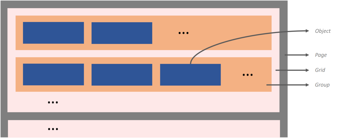
Pages (gray) represent screens that are displayed to the user. The pink boxes (grids) organize several objects together in one or more rows. The orange boxes (groups) further organize sub-groups of objects together on the same row. The blue boxes represent your app's objects.
We recommend first drawing your layouts on pen and paper. Then create your objects and set their properties inside App Builder to match your design. Finally, test your layouts in the App Simulator. Tweak as necessary.
Grid Spacing
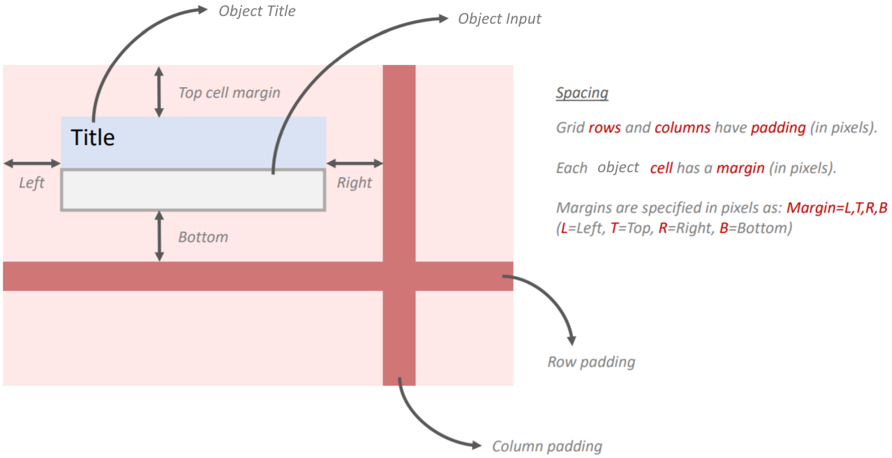
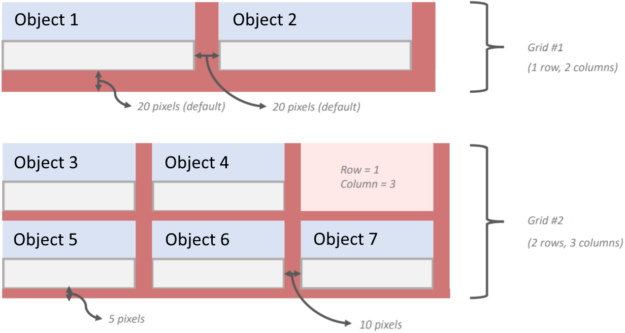
Grid spacing refers to the amount of padding (in pixels) that surround a grid.
All objects in a grid share the same row and column padding. This is useful to know because it means different parts of a page can have different padding values.
Specify these properties and more in an object's settings in App Builder.
Object Margins
While grids have rows and columns with padding (in pixels), each cell that contains an object further has margins (in pixels) that describe the padding on each of its four sides.
Margins are specified in pixels using 'L,T,R,B' syntax.
- L = Left
- T = Top
- R = Right
- B = Bottom
Example: 10,20,10,20