
Button
The Button object type defines a clickable button element for your app.
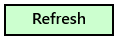
Visual Experience
Below is an example of this object's visual experience.
Properties
Properties are accessible directly on the object panel.
| Name | Required | Description |
|---|---|---|
| Display Title | No | Ignored |
| Button Text | Yes | Label displayed inside the button |
Settings
Settings are additional properties accessible by clicking the Settings button.
| Name | Required | Description |
|---|---|---|
| Grid - Name | No | Name of grid (objects with same name appear together) |
| Grid - Padding Columns Size | No | Pixel value of space between columns |
| Grid - Padding Rows Size | No | Pixel value of space between rows |
| Grid - Column Size | No | Size of column in pixels (empty will auto-size) |
| Grid - Row Size | No | Size of row in pixels (empty will auto-size) |
| --- | --- | --- |
| Group - Name | No | Name of group within grid (objects with same name appear together) |
| --- | --- | --- |
| Sizing - Width | No | Pixel value of object width (empty for default) |
| Sizing - Height | No | Pixel value of object height (empty for default) |
| Sizing - Margin | No | Margin pixel values (L,T,R,B format) |
| --- | --- | --- |
| Title - Show | No | Whether or not to show object title |
| Title - Underline | No | Whether or not to underline object title |
| Title - Margin | No | Margin pixel values (L,T,R,B format) |
| Title - Foreground | No | Foreground color (#RRGGBB format) |
| --- | --- | --- |
| Alignment - Vertical | No | Vertical alignment position within container grid cell |
| Alignment - Horizontal | No | Horizontal alignment position within container grid cell |
| Alignment - Items | No | Alignment orientation for contained items |
| --- | --- | --- |
| Spanning - Column Span | No | # of columns to span in containing grid |
| Spanning - Row Span | No | # of rows to span in containing grid |
| --- | --- | --- |
| Coloring - Background | No | Color of background (#RRGGBB format) |
| Coloring - Foreground | No | Color of foreground (#RRGGBB format) |
| --- | --- | --- |
| Border - Thickness | No | Pixel value of border thickness |
| Border - Color | No | Color of border (#RRGGBB format) |
| --- | --- | --- |
| Migrate | No | Whether or not to migrate values between instances |
Scripting
When a button is clicked, the Ux.Click script is executed.
Refer to the Ux.Click examples below to learn how to execute code when a button is clicked.
Click here to learn more about scripts.
Data Type
None
Remarks
Buttons do not have any data to store. Their sole purpose is to execute code when clicked via the Ux.Click script.
Examples
When buttons are clicked, the Ux.Click script is executed. Below are two examples of how to execute code when a button is clicked. Notice that you can detect which button is clicked using the script.args object. The first argument is the object's ID. The second argument is the object's Name.
// displays a popup message when button object with name 'butAlert' is clicked
if (script.args[1] === 'butAlert')
{
    user.alert("Hello, world!");
}
// displays a popup message when button object with id 15 is clicked
if (script.args[0] === 15)
{
    user.alert("Hello, world!");
}